Jon Udell posted recently about a compelling graphic in the New York Times:
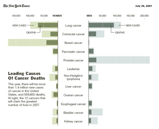
This is a very intruiging graph that immediately gets you thinking about survival rates, about whether new cases are rising or falling, and the obvious contrasts between, say, prostate and pancreatic cancers. But Jon then goes on to link to a post about how to make graphs like this yourself featuring your own numbers (sales? expenses? bug rates? time spent?) in Excel. I am consistent amazed at what Excel will do for people who know what they're doing. Check it out.